5 Graphical exploration of the data
A graphic exploration of the data is the first step in their analysis. It consists in visually assessing relations between variables in order to gain an idea of the type of model to be fitted. In practice, points are plotted on a graph as a cluster, the coordinates of which correspond to two variables: effect variable on the \(x\) axis and response variable on the \(y\) axis. A graph can be plotted only for at most two variables simultaneously (three-dimensional graphs cannot in practice be assessed visually). To explore graphically the relations between \(p\) variables (where \(p>1\)), a total of \(p(p-1)/2\) graphs should be plotted of one variable against the other and/or efforts should be made to construct combined effect variables from several effect variables (we will return to this point in § 5.1.1).
Let us now suppose that we have one response variable \(Y\) (volume, biomass\(\ldots\)) and \(p\) effect variables \(X_1\), \(X_2\), \(\ldots\), \(X_p\) (dbh, height\(\ldots\)). The aim of the graphical exploration is not to select from among the \(p\) effect variables those that will in fact be used for the model: when we select variables we need to be able to test the significant nature of a variable, which only comes later in the next phase of model fitting. The \(p\) effect variables are therefore considered as fixed, and we look to determine the form of model that best links variable \(Y\) to variables \(X_1\) to \(X_p\). A model is made up of two terms: the mean and the error (or residual). The graphical exploration aims to specify both the form of the mean relation and the form of the error, without any concern for the value of model parameters (dealt with in the next model-fitting step). The mean relation may be linear or non linear, linearizable or not; the residual error may be additive or multiplicative, of constant variance (homoscedasticity) or not (heteroscedasticity). By way of an illustration, Figure 5.1 shows four examples where the relation is linear or not, and the variance of the residuals is constant or not.
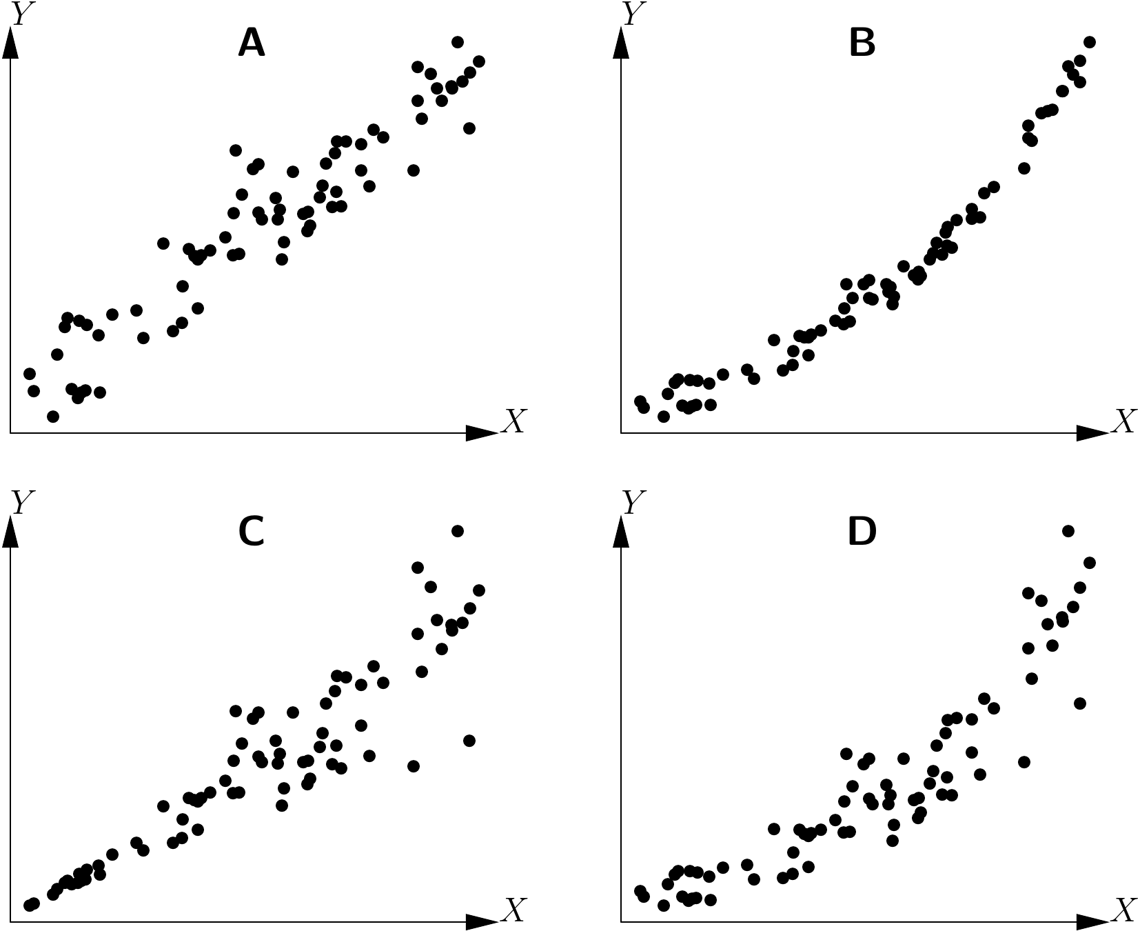
Figure 5.1: Example of relations between two variables \(X\) and \(Y\): linear relation and constant variance of the residuals, (B) non linear relation and constant variance of the residuals, (C) linear relation and non constant variance of the residuals, (D) non linear relation and non constant variance of the residuals.
The graphical exploration of the data phase is also necessary to avoid falling into the traps of “blind” fitting: the impression can be gained that the model accurately fits the data, whereas in fact this result is an artifact. This is illustrated in Figure 5.2 for a linear relation. In all four cases shown in this figure the \(R^2\) of the linear regression of \(Y\) against \(X\) is high, while in actual fact the linear relation \(Y=a+bX+\varepsilon\) does not fit the data. In Figure 5.2A, the cluster of points is split into three subsets, each of which shows a linear relation between \(Y\) and \(X\) with a negative correlation coefficient. But the three subsets are located along a line that has a positive slope, i.e. that reflecting the linear regression. In 5.2B, the cluster of points, except one outlier (very likely an aberrant value), does not show any relation between \(Y\) and \(X\). But the outlier is sufficient to make it look as though there is a positive relation between \(Y\) and \(X\). In 5.2C, the relation between \(Y\) and \(X\) is parabolic. Finally, in 5.2D, the cluster of points, except one outlier, is located along a line with a positive slope. In this case, a linear relation between \(Y\) and \(X\) is well suited to describing the data, once the outlier has been removed. This outlier artificially reduces the value of \(R^2\) (contrary to the situation in Figure 5.2B where the outlier artificially increases \(R^2\)).
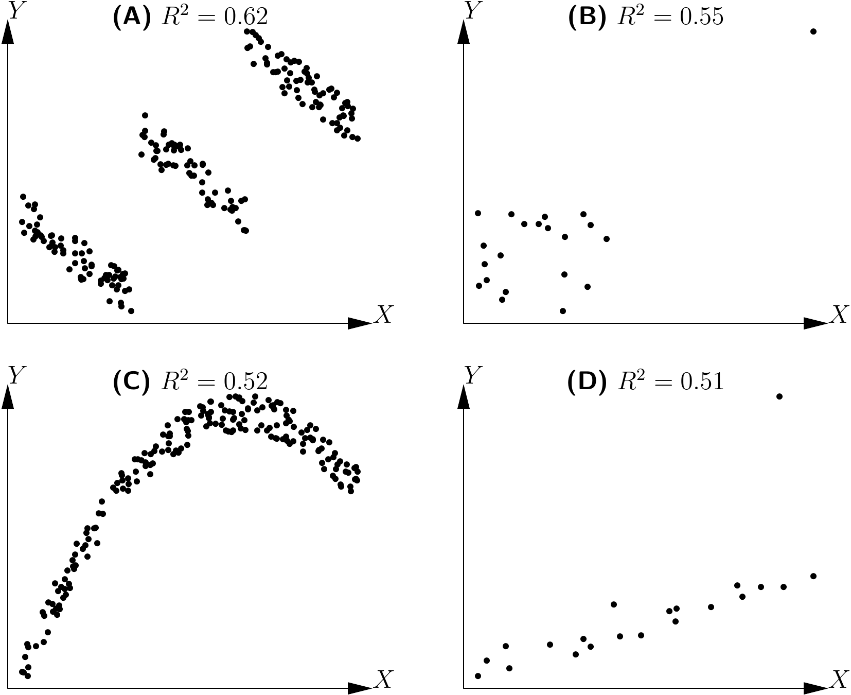
Figure 5.2: Determination coefficients (\(R^2\)) of linear regressions for clusters of points not showing a linear relation.
As indicated by its name, this graphical exploration phase is more an exploration than a systematic method. Although some advice can be given in matters of finding the right model, the process requires both experience and intuition.
5.1 Exploring the mean relation
Here in this section we will focus on the graphical method used to determine the nature of the mean relation between two variables \(X\) and \(Y\), i.e. on how to find the form of the function \(f\) (if it exists!) such that \(\mbox{E}(Y)=f(X)\). When there is only one effect variable \(X\), the graphical exploration consists in plotting the cluster of points \(Y\) against \(X\).
Red line 5.1 \(\looparrowright\) Exploring the biomass–dbh relation
To visualize the form of the relation between total dry biomass and dbh, the biomass cluster of points should be plotted against dbh. As the dataset has already been read (see red line 4.1 or 1), the following command can be used to plot the cluster of points:
The resulting scatter plot is shown in Figure 5.3. This cluster of points is of the same type as that in Figure 5.1D: the relation between biomass and dbh is not linear, and the variance of the biomass increases with dbh.
As the scatter plot graphical method is applicable only to one effect variable, we should attempt to achieve this when there are several effect variables. Let us first explain this point.
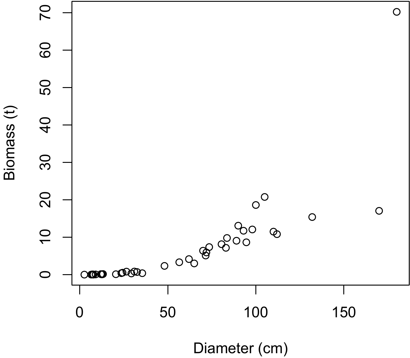
Figure 5.3: Scatter plot of total dry biomass (tonnes) against diameter at breast height (cm) for the 42 trees measured in Ghana by Henry et al. (2010).
5.1.1 When there is more than one effect variable
The first step is to determine whether it is possible to form a single combined effect variable out of the several effect variables considered. For example, if we are looking to predict trunk volume from its dbh \(D\) and its height \(H\), we can be sure that the new variable \(D^2H\) will be an effective predictor. We have therefore taken two effect variables, \(D\) and \(H\) and used them to form a new (single!) effect variable, \(D^2H\). As an illustration of this, Louppe, Koua, and Coulibaly (1994) created the following individual volume model for Afzelia africana in the Badénou forest reserve in Côte d’Ivoire: \[ V=-0.0019+0.04846C^2H \] where \(V\) is total volume in m\(^3\), \(C\) is circumference at 1.30 m in m and \(H\) is height in m. Although this table is double-entry (girth and height), it in fact contains only one effect variable: \(C^2H\). Another example is the stand volume model established by Fonweban and Houllier (1997) in Cameroon for Eucalyptus saligna: \[ V=\beta_1G^{\beta_2}\left(\frac{H_0}{N}\right)^{\beta_3} \] where \(V\) is stand volume in m3 ha-1, \(G\) is basal area in m2 ha-1, \(H_0\) is the height of the dominant tree in the stand, \(N\) is stand density (number of stems per hectare) and \(\beta\) are constants. Although this table is triple-entry (basal area, dominant height and density), it in fact contains only two effect variables: \(G\) and the ratio \(H_0/N\).
Red line 5.2 \(\looparrowright\) Exploring the biomass–\(D^2H\) relation
Compared with a double-entry biomass model using dbh \(D\) and height \(H\), the \(D^2H\) data item constitutes an approximation of trunk volume (to within the form factor) and can therefore be used as a combined effect variable. The scatter plot of biomass points against \(D^2H\) is obtained by the command:
and the result is shown in Figure 5.4. This cluster of points is of the same type as that in Figure 5.1C: the relation between biomass and \(D^2H\) is linear, but the variance of the biomass increases with \(D^2H\).
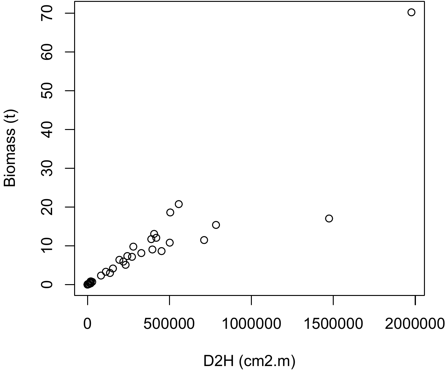
Figure 5.4: Scatter plot of total dry biomass (tonnes) against \(D^2H\), where \(D\) is diameter at breast height (cm) and \(H\) height (m) for the 42 trees measured in Ghana by Henry et al. (2010).
Assume that, once the effect variables have been aggregated, we are still left with \(p\) effect variables \(X_1\), \(\ldots\), \(X_p\) (with \(p>1\)). We could first explore the \(p\) relations between \(Y\) and each of the \(p\) effect variables. As these take the form of relations between two variables, the graphical methods presented hereafter are perfectly suitable. However, this approach often yields little information as the relation between \(Y\) and \(p\) variables does not boil down to the \(p\) relations between \(Y\) and each of the \(p\) variables separately. A simple example can clearly illustrate this: let us suppose that variable \(Y\) is (to within the errors) the sum of two effect variables: \[\begin{equation} Y=X_1+X_2+\varepsilon\tag{5.1} \end{equation}\] where \(\varepsilon\) is a zero expectation error, and variables \(X_1\) and \(X_2\) are related such that \(X_1\) varies between 0 and \(-X_{\max}\) and, for a given \(X_1\), \(X_2\) varies between \(\max(0,-X1)\) and \(\min(X_{\max},1-X_1)\). Figure 5.5 shows the two plots of \(Y\) against each of the effect variables \(X_1\) and \(X_2\) using simulated data for this model (with \(X_{\max}=5\)). The cluster of points does not appear to have any particular structure, and no model is therefore detected that generates \(\mbox{E}(Y)=X_1+X_2\).
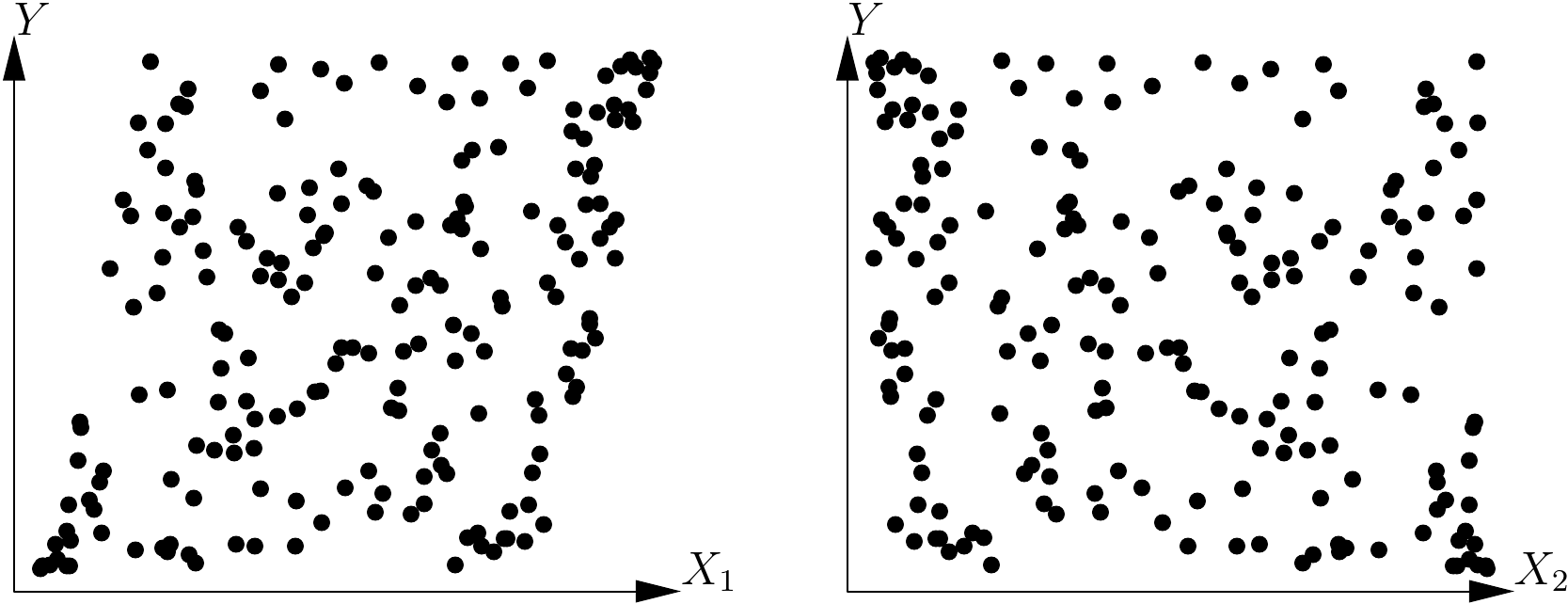
Figure 5.5: Plots of variable \(Y\) against each of the effect variables \(X_1\) and \(X_2\) such that \(\mbox{E}(Y)=X_1+X_2\).
When we have two effect variables, one way to solve the problem is by conditioning. This consists in looking at the relation between the response variable \(Y\) and one of the effect variables (let us say \(X_2\)) conditionally on the values of the other effect variable (in this case \(X_1\)). In practice, we divide the dataset into classes based on the value of \(X_1\), then we explore the relation between \(Y\) and \(X_2\) in each data subset. If we consider again the previous example, we divide the values of \(X_1\) into 12 large intervals of 0.5 units: the first ranging from \(-5\) to \(-4.5\), the second from \(-4.5\) to \(-4\), etc., up to the last interval that ranges from 0.5 to 1. The dataset shown in Figure 5.5 has therefore been divided into 12 data subsets based on the 12 classes of \(X_1\) values, and 12 plots can be constructed of \(Y\) against \(X_2\) for each of these 12 data subsets. The result is shown in Figure 5.6. If we superimpose all the plots in Figure 5.6 this will give the plot shown on the right in Figure 5.5. These plots show that, for any given value of \(X_1\), relation between \(Y\) and \(X_2\) is indeed linear. Additionally, we can see that the slope of the line of \(Y\) plotted against \(X_2\) for any given \(X_1\) has the same constant value for all values of \(X_1\). This graphical exploration therefore shows that the model takes the form: \[ \mbox{E}(Y)=f(X_1)+aX_2 \] where \(a\) is a constant coefficient (in this case it has a value of 1, but the graphical exploration is not concerned with parameter values), and \(f(X_1)\) is the y-intercept of the line generated by plotting \(Y\) against \(X_2\) for a given value of \(X_1\). This y-intercept potentially varies with \(X_1\), in accordance with function \(f\) that remains to be determined.
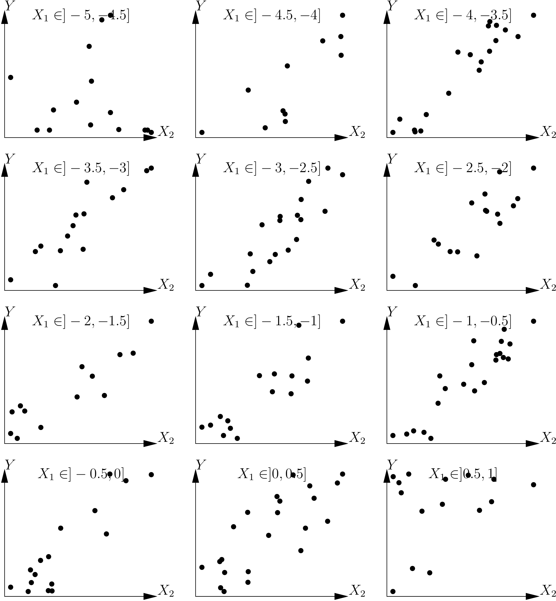
Figure 5.6: Plots of a response variable against an effect variable \(X_2\) for each of the data subsets defined by the value classes of another effect variable \(X_1\), with \(\mbox{E}(Y)=X_1+X_2\).
In order to explore the form of function \(f\), we can plot a linear regression for each of the 12 data subsets of \(Y\) and \(X_2\) corresponding to the 12 classes of \(X_1\) values. The y-intercept of each of these 12 lines is then recorded, called \(y_0\), and a graph is plotted of \(y_0\) against the middle of each class of \(X_1\) values. This plot is shown in Figure 5.7 for the same simulated data as previously. This graphical exploration shows that the relation between \(y_0\) and \(X_1\) is linear, i.e.: \(f(X_1)=bX_1+c\). Altogether, the graphical exploration based on the conditioning relative to \(X_1\) showed that an adequate model is: \[ \mbox{E}(Y)=aX_2+bX_1+c \]

Figure 5.7: Plot of the y-intercepts of linear regressions between \(Y\) and \(X_2\) for data subsets corresponding to classes of \(X_1\) values against the middle of these classes, for data simulated in accordance with the model \(Y=X_1+X_2+\varepsilon\).
Given that the variables \(X_1\) and \(X_2\) play symmetrical roles in the model (5.1), the conditioning is also symmetrical with regard to these two variables. Here we have studied the relation between \(Y\) and \(X_2\) conditionally on \(X_1\), but would have arrived, in the same manner, at the same model had we explored the relation between \(Y\) and \(X_1\) conditionally on \(X_2\).
In this example, the relation between \(Y\) and \(X_2\) for a given \(X_1\) is a line whose slope is independent of \(X_2\): it may be said that there is no interaction between \(X_1\) and \(X_2\). A model with an interaction would, for example, correspond to: \(\mbox{E}(Y)=X_1+X_2+X_1X_2\). In this case, the relation between \(Y\) and \(X_2\) at a given \(X_1\) is a line whose slope, which is \(1+X_1\), is indeed dependent on \(X_1\). The conditioning used means that we can without additional difficulty explore the form of models that include interactions between effect variables.
This conditioning can, in principle, be extended to any number of effect variables.For three effect variables \(X_1\), \(X_2\), \(X_3\) for example, we could explore the relation between \(Y\) and \(X_3\) with \(X_1\) and \(X_2\) fixed and note \(f\) the function defining this relation and \(\theta(X_1,\ X_2)\) the parameters of \(f\) (that potentially depend on \(X_1\) and \(X_2\)): \[ \mbox{E}(Y)=f[X_3;\ \theta(X_1,\ X_2)] \] We would then explore the relation between \(\theta\) and the two variables \(X_1\) and \(X_2\). Again, we would condition by exploring the relation between \(\theta\) and \(X_2\) with \(X_1\) fixed; and note \(g\) the function defining this relation and \(\phi(X_1)\) the parameters of \(g\) (that potentially depend on \(X_1\)): \[ \theta(X_1,\ X_2)=g[X_2;\ \phi(X_1)] \] Finally, we would explore the relation between \(\phi\) and \(X_1\); i.e. \(h\) the function defining this relation. Ultimately, the model describing the data corresponds to: \[ \mbox{E}(Y)=f\{X_3;\ g[X_2;\ h(X_1)]\} \] This reasoning may, in principle, be extended to any number of effect variables, but it is obvious, in practice, that it becomes difficult to implement for \(p>3\). This conditioning requires a great deal of data as each data subset, established by the value classes of the conditional variables, must include sufficient data to allow a valid graphical exploration of the relations between variables. When using three effect variables, the data subsets are established by crossing classes of \(X_1\) and \(X_2\) values (for example). If the full dataset includes \(n\) observations, if \(X_1\) and \(X_2\) are divided into 10 value classes, and if the data are evenly distributed between these classes, then each data subset will contain only \(n/100\) observations! Therefore, in practice, and unless the dataset is particularly huge, it is difficult to use the conditioning method for more than two effect variables.
The number of entries employed when fitting biomass or volume tables is in most cases limited to at most two or three, meaning that we generally are not faced with the problem of conducting the graphical exploration with a large number of effect variables. Otherwise, multivariate analyses such as the principal components analysis may be usefully employed (Philippeau 1986; Härdle and Simar 2003). These analyses aim to project the observations made onto a reduced subspace (usually in two or three dimensions), constructed from linear combinations of effect variables and in such a manner to maximize the variability of the observations in this subspace. In other words, these multivariate analyses can be used to visualize relations between variables while losing as little information as possible, which is precisely the aim of graphical exploration.
Red line 5.3 \(\looparrowright\) Conditioning on wood density
Let us now explore the relation between biomass, \(D^2H\) and wood density \(\rho\). Let us define n classes of wood density such that each class contains approximately the same number of observations:
The object d defines the limits of the density classes while object i contains the number of the density class to which each observation belongs. The plot of biomass against \(D^2H\) on a log scale, with different symbols and colors for the different density classes, may be obtained by the command:
with(dat,plot(
  dbh^2 * heig, Btot, xlab = "D2H (cm2m)", ylab = "Biomass (t)", log = "xy",
  pch = i, col = i
  ))
and is shown in Figure 5.8 for n=4 wood density classes. Pre-empting chapter 6, we will now plot the linear regression between \(\ln(B)\) and \(\ln(D^2H)\) for each subset of observations corresponding to each wood density class:
m <- as.data.frame(lapply(split(dat, i), function(x)
  coef(lm(log(Btot) ~ I(log(dbh^2 * heig)), data = x[x$Btot > 0,]))))
When we plot the y-intercepts of the regression and its slopes against median wood density for the class:
dmid <- (d[-1] + d[-n]) / 2
plot(dmid, m[1,], xlab = "Wood density (g/cm3)", ylab = "y-Intercept")
plot(dmid, m[2,], xlab = "Wood density (g/cm3)", ylab = "Slope")
this at first sight does not appear to yield any particular relation (Figure 5.9).
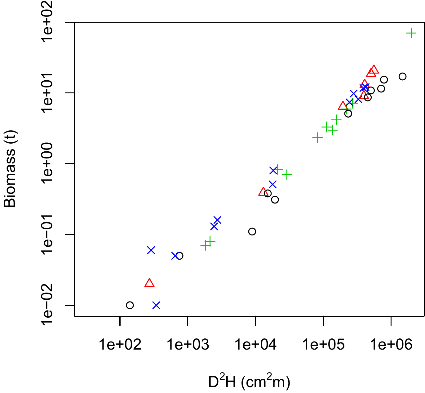
Figure 5.8: Scatter plot (log-transformed data) of total dry biomass (tonnes) against \(D^2H\), where \(D\) is diameter at breast height (cm) and \(H\) is height (m) for the 42 trees measured in Ghana by Henry et al. (2010) with different symbols for the different wood density classes: black circles, \(0.170\leq\rho<0.545\) g cm-3; red triangles, \(0.545\leq\rho<0.600\) g cm-3; green plus signs, \(0.600\leq\rho<0.650\) g cm-3; blue crosses, \(0.650\leq\rho<0780\) g cm-3.
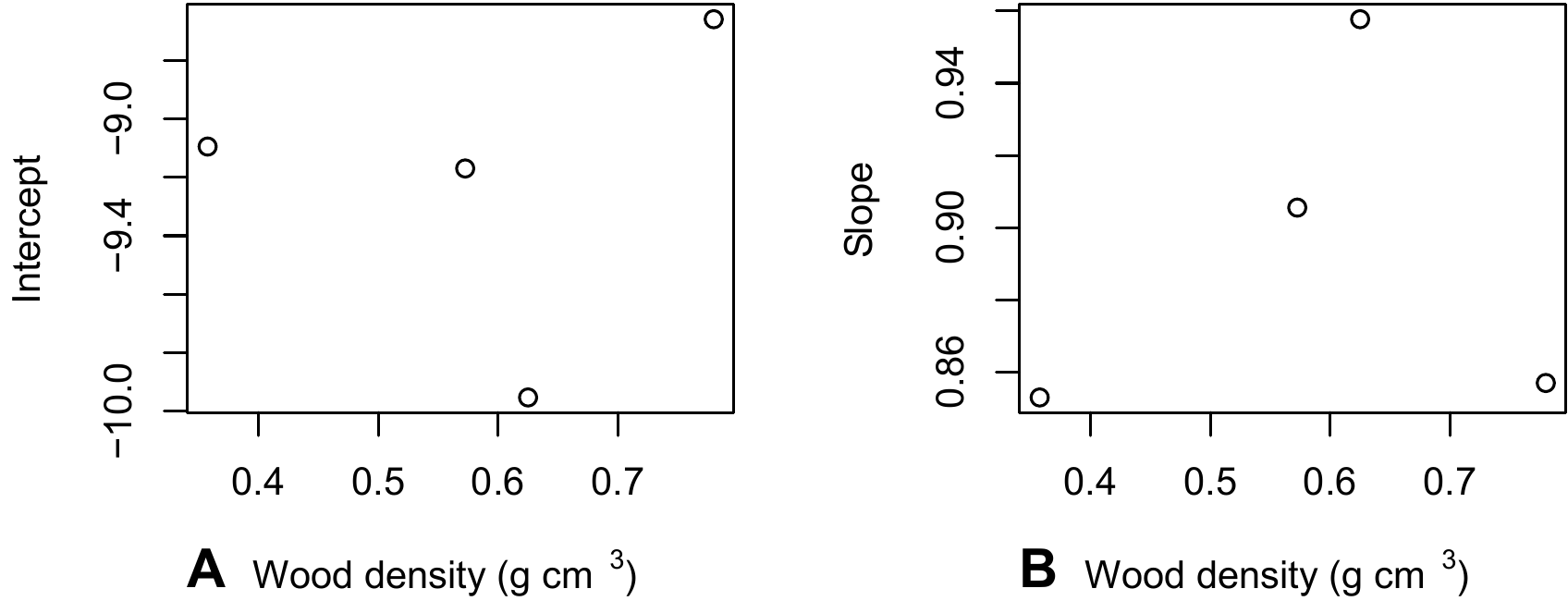
Figure 5.9: Y-intercept \(a\) and slope \(b\) of the linear regression \(\ln(B)=a+b\ln(D^2H)\) conditioned on wood density class, against the median wood density of the classes. The regressions were plotted using the data from the 42 trees measured by Henry et al. (2010) au Ghana.
5.1.2 Determining whether or not a relation is adequate
Henceforth, we will assume that we have a single effect variable \(X\) and that we are looking to explore the relation between \(X\) and the response variable \(Y\). The first step is to plot all the cluster of points on a graph, with \(X\) on the x-axis and \(Y\) on the y-axis. We then need to guess visually the function that passes through the middle of this cluster of points while following its shape. In fact, the human eye is not very good at discriminating between similar shapes. For example, Figure 5.10 shows three scatter plots corresponding to the three following models, but not in the right order (the error term here has been set at zero): \[ \begin{array}{lcl} \mbox{power model:} && Y=aX^b \\\mbox{exponential model:} && Y=a\exp(bX) \\\mbox{polynomial model:} && Y=a+bX+cX^2+dX^3 \end{array} \] The three scatter plots look fairly similar, and it would be no mean feat to sort out which one corresponds to which model.
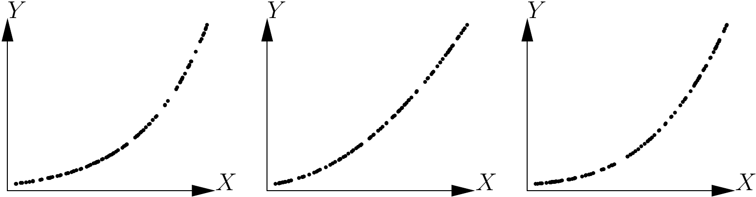
Figure 5.10: Three scatter points corresponding to three models: power model, exponential model and polynomial model, but not in the right order.
By contrast, the human eye is very good at detecting whether a relation is linear or not. To detect visually whether or not the shape of a cluster of points fits a function, it is therefore greatly in our interests when possible to use a variables transformation that renders the relation linear. For instance, in the case of the power model, \(Y=aX^b\) yields \(\ln Y=\ln a+b\ln X\), and this variables transformation: \[\begin{equation} \left\{ \begin{array}{l} X'=\ln X\\ Y'=\ln Y \end{array} \right.\tag{5.2} \end{equation}\] renders the relation linear. In the case of the exponential model, \(Y=a\exp(bX)\) yields \(\ln Y=\ln a+bX\), and this variables transformation: \[\begin{equation} \left\{ \begin{array}{l} X'=X\\ Y'=\ln Y \end{array} \right.\tag{5.3} \end{equation}\] renders the relation linear. By contrast, neither of these two transformation is able to render the polynomial relation linear. If we apply these transformations to the data presented in Figure 5.10, we should be able to detect which of the scatter plots corresponds to which model. Figure 5.11 shows the three scatter plots after transforming the variables as in (5.3). The first scatter plot takes the form of a straight line while the two others are still curves. The scatter plot on the left of Figure 5.10 therefore corresponds to the exponential model.
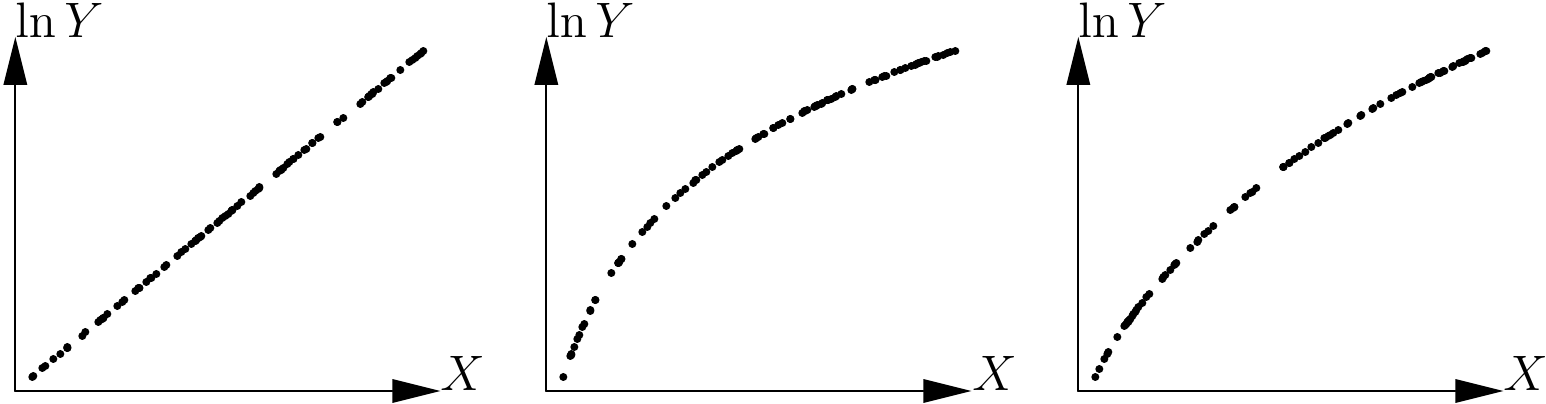
Figure 5.11: Application of the variables transformation \(X\rightarrow X\), \(Y\rightarrow\ln Y\) to the scatter plots given in 5.10.
Figure 5.12 shows the three scatter plots after transforming the variables as in (5.2).The second scatter plot takes the form of a straight line while the two others are still curves. The scatter plot in the center of Figure 5.10 therefore corresponds to the power model. By deduction, the scatter plot on the right of Figure 5.10 corresponds to the polynomial model.
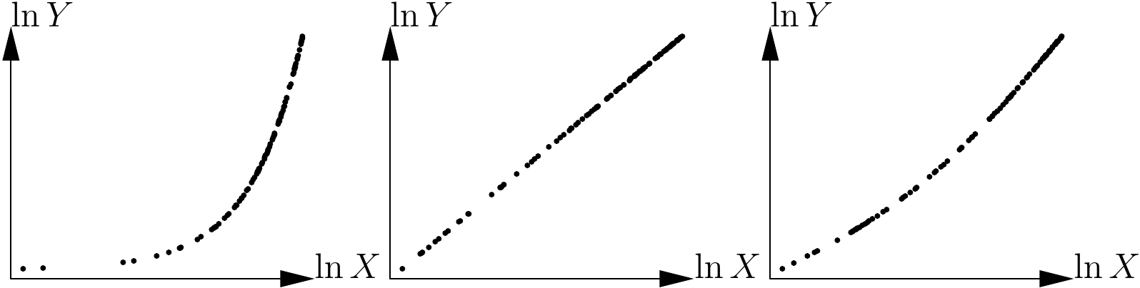
Figure 5.12: Application of the variables transformation \(X\rightarrow\ln X\), \(Y\rightarrow\ln Y\) to the scatter plots shown in 5.10.
It is not always possible to find a variable transformation that renders the relation linear. This, for instance, is precisely the case of the polynomial model \(Y=a+bX+cX^2+dX^3\): no transformation of \(X\) into \(X'\) and of \(Y\) into \(Y'\) was found such that the relation between \(Y'\) and \(X'\) is a straight line, whatever the coefficients \(a\), \(b\), \(c\) et \(d\). It must also be clearly understood that the linearity we are talking about here is that of the relation between the response variable \(Y\) and the effect variable \(X\). It is not linearity in the sense of the linear model, which describes linearity with regards to model coefficients (thus, the model \(Y=a+bX^2\) is linear in the sense of the linear model whereas it describes a non-linear relation between \(X\) and \(Y\)).
When no transformation of the variable is able to render the relation between \(X\) and \(Y\) linear, the best approach is to fit the model and determine visually whether the fitted model passes through the middle of the cluster of points and follows its shape. Also, in this case, we have much to gain by examining the plot of the residuals against the fitted values.
Red line 5.4 \(\looparrowright\) Exploring the biomass–dbh relation: variables transformation
Let us use the log transformation to transform simultaneously both dbh and biomass. The scatter plot of the log-transformed data is obtained as follows:
The resulting scatter plot is shown in Figure 5.13. The log transformation has rendered linear the relation between biomass and dbh: the relation between \(\ln(D)\) and \(\ln(B)\) is a straight line and the variance of \(\ln(B)\) does not vary with diameter (like in Figure 5.1A).
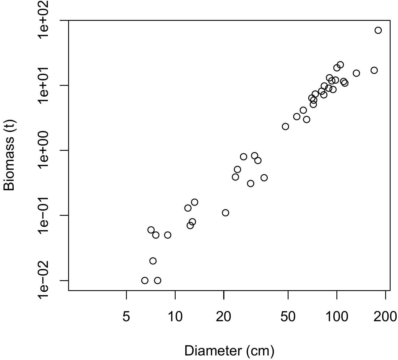
Figure 5.13: Scatter plot (log-transformed data) of total dry biomass (tonnes) against diameter at breast height (cm) for the 42 trees measured in Ghana by Henry et al. (2010).
Red line 5.5 \(\looparrowright\) Exploring the biomass–\(D^2H\) relation: variables transformation
Let us use the log transformation to transform simultaneously both \(D^2H\) and biomass. The scatter plot of the log-transformed data is obtained as follows:
with(dat, plot(
  x = dbh^2 * heig, y = Btot, xlab = "D2H (cm2.m)", ylab = "Biomass (t)",
  log = "xy"
  ))
The resulting scatter plot is shown in Figure 5.14. The log transformation has rendered linear the relation between biomass and \(D^2H\): the relation between \(\ln(D^2H)\) and \(\ln(B)\) is a straight line and the variance of \(\ln(B)\) does not vary with \(D^2H\) (like in Figure 5.1A).
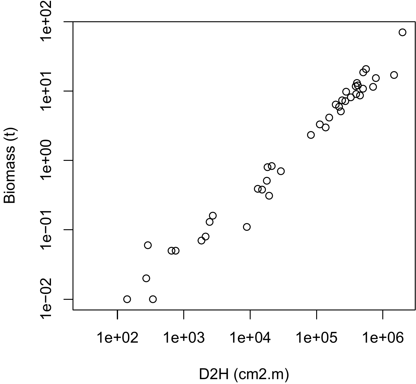
Figure 5.14: Scatter plot (log-transformed data) of total dry biomass (tonnes) against \(D^2H\), where \(D\) is diameter at breast height (cm) and \(H\) is height (m) for the 42 trees measured in Ghana by Henry et al. (2010).
5.1.3 Catalog of primitives
If we consider the tables calculated by Zianis et al. (2005) for Europe, by Henry et al. (2011) for sub-Saharan Africa, or more specifically by Hofstad (2005) for southern Africa, this gives an idea as to the form of the models most commonly found in the literature on biomass and volume tables. This shows that two models are often used: the power model and the (second, or at most, third order) polynomial model. These two models are therefore useful starting points for the graphical exploration of data when looking to construct a volume or biomass model. The power model \(Y=aX^b\) is also known as an allometric relation and the literature contains a number of biological interpretations of this model (Gould 1979; Franc, Gourlet-Fleury, and Picard 2000, sec. 1.1.5). In particular, the “metabolic scaling theory” (Enquist, Brown, and West 1998; Enquist et al. 1999; West, Brown, and Enquist 1997, 1999) predicts in a theoretical manner, and based on a fractal description of the internal structure of trees, that the biomass of a tree is related to its dbh by a power relation where the exponent is \(8/3\approx2.67\): \[ B\propto\rho D^{8/3} \] where \(\rho\) is specific wood density. Although metabolic scaling theory has been widely criticized (Muller-Landau et al. 2006), it does at least have the merit of laying a biological basis for this often observed power relation.
In addition to this power model \(B=aD^b\) and the second-order polynomial model \(B=a_0+a_1D+a_2D^2\), and without pretending in any way to be exhaustive, the following biomass tables are also often found (Yamakura et al. 1986; Brown, Gillespie, and Lugo 1989; Brown 1997; Martinez-Yrizar et al. 1992; Araújo, Higuchi, and Carvalho 1999; Nelson et al. 1999; Ketterings et al. 2001; Chave, Riéra, and Dubois 2001; Chave et al. 2005; Nogueira et al. 2008; Basuki et al. 2009; Návar 2009; Djomo et al. 2010; Henry et al. 2010):
double-entry model of the power form in relation to the variable \(D^2H\): \(B=a(\rho D^2H)^b\)
double-entry model: \(\ln(B)=a_0+a_1\ln(D)+a_2\ln(H)+a_3\ln(\rho)\)
single-entry model: \(\ln(B)=a_0+a_1\ln(D)+a_2[\ln(D)]^2+a_3[\ln(D)]^3+a_4\ln(\rho)\),
where \(\rho\) is specific wood density. To within the form factor, the variable \(D^2H\) corresponds to the volume of the trunk, which explains why it is so often used as effect variable. The second equation may be considered to be a generalization of the first for if we apply the log transformation, the first equation is equivalent to: \(\ln(B)=\ln(a)+2b\ln(D)+b\ln(H)+b\ln(\rho)\). The first equation is therefore equivalent to the second in the particular case where \(a_2=a_3=a_1/2\). Finally, the third equation may be considered to be a generalization of the power model \(B=aD^b\).
| Name | Equation | Transformation |
|---|---|---|
| Polynomial models | ||
| linear | \(Y=a+bX\) | same |
| parabolic or quadratic | \(Y=a+bX+cX^2\) | |
| \(p\)-order polynomial | \(Y=a_0+a_1X+a_2X^2+\ldots+a_pX^p\) | |
| Exponential models | ||
| exponential or Malthus | \(Y=a\exp(bX)\) | \(Y'=\ln Y\), \(X'=X\) |
| modified exponential | \(Y=a\exp(b/X)\) | \(Y'=\ln Y\), \(X'=1/X\) |
| logarithm | \(Y=a+b\ln X\) | \(Y'=Y\), \(X'=\ln X\) |
| reciprocal log | \(Y=1/(a+b\ln X)\) | \(Y'=1/Y\), \(X'=\ln X\) |
| Vapor pressure | \(Y=\exp(a+b/X+c\ln X)\) | |
| Power law models | ||
| power | \(Y'=\ln Y\) | \(Y'=\ln Y\), \(X'=\ln X\) |
| modified power | \(Y=ab^X\) | \(Y'=\ln Y\), \(X'=X\) |
| shifted power | \(Y=a(X-b)^c\) | |
| geometric | \(Y=aX^{bX}\) | \(Y'=\ln Y\), \(X'=X\ln X\) |
| modified geometric | \(Y=aX^{b/X}\) | \(Y'=\ln Y\), \(X'=(\ln X)/X\) |
| root | \(Y=ab^{1/X}\) | \(Y'=\ln Y\), \(X'=1/X\) |
| Hoerl’s model | \(Y=ab^XX^c\) | |
| modified Hoerl’s model | \(Y=ab^{1/X}X^c\) | |
| Production-density models | ||
| inverse | \(Y=1/(a+bX)\) | \(Y'=1/Y\), \(X'=X\) |
| quadratic inverse | \(Y=1/(a+bX+cX^2)\) | |
| Bleasdale’s model | \(Y=(a+bX)^{-1/c}\) | |
| Harri’s model | \(Y=1/(a+bX^c)\) | |
| Growth models | ||
| saturated growth | \(Y=aX/(b+X)\) | \(Y'=X/Y\), \(X'=X\) |
| mononuclear or Mitscherlich’s model | \(Y=a[b-\exp(-cX)]\) | |
| Sigmoidal models | ||
| Gompertz | \(Y=a\exp[-b\exp(-cX)]\) | |
| Sloboda | \(Y=a\exp[-b\exp(-cX^d)]\) | |
| logistic or Verhulst | \(Y=a/[1+b\exp(-cX)]\) | |
| Nelder | \(Y=a/[1+b\exp(-cX)]^{1/d}\) | |
| von Bertalanffy | \(Y=a[1-b\exp(-cX)]^3\) | |
| Chapman-Richards | \(Y=a[1-b\exp(-cX)]^d\) | |
| Hossfeld | \(Y=a/[1+b(1+cX)^{-1/d}]\) | |
| Levakovic | \(Y=a/[1+b(1+cX)^{-1/d}]^{1/e}\) | |
| multiple multiplicative factor | \(Y=(ab+cX^d)/(b+X^d)\) | |
| Johnson-Schumacher | \(Y=a\exp[-1/(b+cX)]\) | |
| Lundqvist-Matérn or de Korf | \(Y=a\exp[-(b+cX)^d]\) | |
| Weibull | \(Y=a-b\exp(-cX^d)\) | |
| Miscellaneous models | ||
| hyperbolic | \(Y=a+b/X\) | \(Y'=Y\), \(X'=1/X\) |
| sinusoidal | \(Y=a+b\cos(cX+d)\) | |
| heat capacity | \(Y=a+bX+c/X^2\) | |
| Gaussian | \(Y=a\exp[-(X-b)^2/(2c^2)]\) | |
| rational fraction | \(Y=(a+bX)/(1+cX+dX^2)\) | |
More generally, Table 5.1 gives a number of functions that are able to model the relation between the two variables. It is indicated when variables have been transformed to render linear the relation between \(X\) and \(Y\). It should be noted that the modified power model is simply a re-writing of the exponential model, and that the root model is simply a re-writing of the modified exponential model. It should also be noted that a large proportion of these models are simply special cases of more complex models that contain more parameters. For example, the linear model is simply a special case of the polynomial model, and the Gompertz model is simply a special case of the Sloboda model, etc.
The \(p\) order polynomial model should be used with caution as polynomials are able to fit any form provided the \(p\) order is sufficiently high (the usual functions can all be decomposed in a polynomials database: this is the principle of limited development). In practice, we may have a polynomial that very closely follows the form of the cluster of points across the range of values available, but which assumes a very unlikely form outside this range. In other words, the polynomial model may present a risk when extrapolating, and the higher the \(p\) order, the greater the risk. In practice, therefore, fitting greater than 3rd order polynomials should be avoided.
5.2 Exploring variance
Let us now consider the model’s error term \(\varepsilon\) that links the response variable \(Y\) to an effect variable \(X\). Exploring the form of the variance corresponds basically to answering the question: is the variance of the residuals constant (homoscedasticity) or not (heteroscedasticity)? The reply to this question depends implicitly on the precise form of the relation that will be used to fit the model. For example, for the power relation \(Y=aX^b\), we can
either fit the non-linear model \(Y=aX^b+\varepsilon\), which corresponds to estimating parameters \(a\) and \(b\) directly;
or fit the linear model \(Y'=a'+bX'+\varepsilon\) to the transformed data \(Y'=\ln Y\) and \(X'=\ln X\), which corresponds to estimating parameters \(a'=\ln a\) and \(b\).
These two options are obviously not interchangeable as the error term \(\varepsilon\) (which we assume follows a normal distribution of constant standard deviation) does not play the same role in the two cases. In the first case the error is additive with respect to the power model. In the second case the error is additive with respect to the linearized model. Therefore, if we return to the power model: \[ Y=\exp(Y')=aX^b\ \exp(\varepsilon)=aX^b\ \varepsilon' \] which corresponds to a multiplicative error with respect to the power model, where \(\varepsilon'\) follows a lognormal distribution. The difference between these two options is illustrated in Figure 5.15. The additive error is expressed by a constant variance in the plot (a) of \(Y\) against \(X\) and by a variance that decreases with \(X\) in the plot (c) of the same, but log-transformed, data. The multiplicative error is expressed by a variance that increases with \(X\) in the plot (b) of \(Y\) against \(X\) and by a constant variance in the plot (d) of the same, but log-transformed, data.
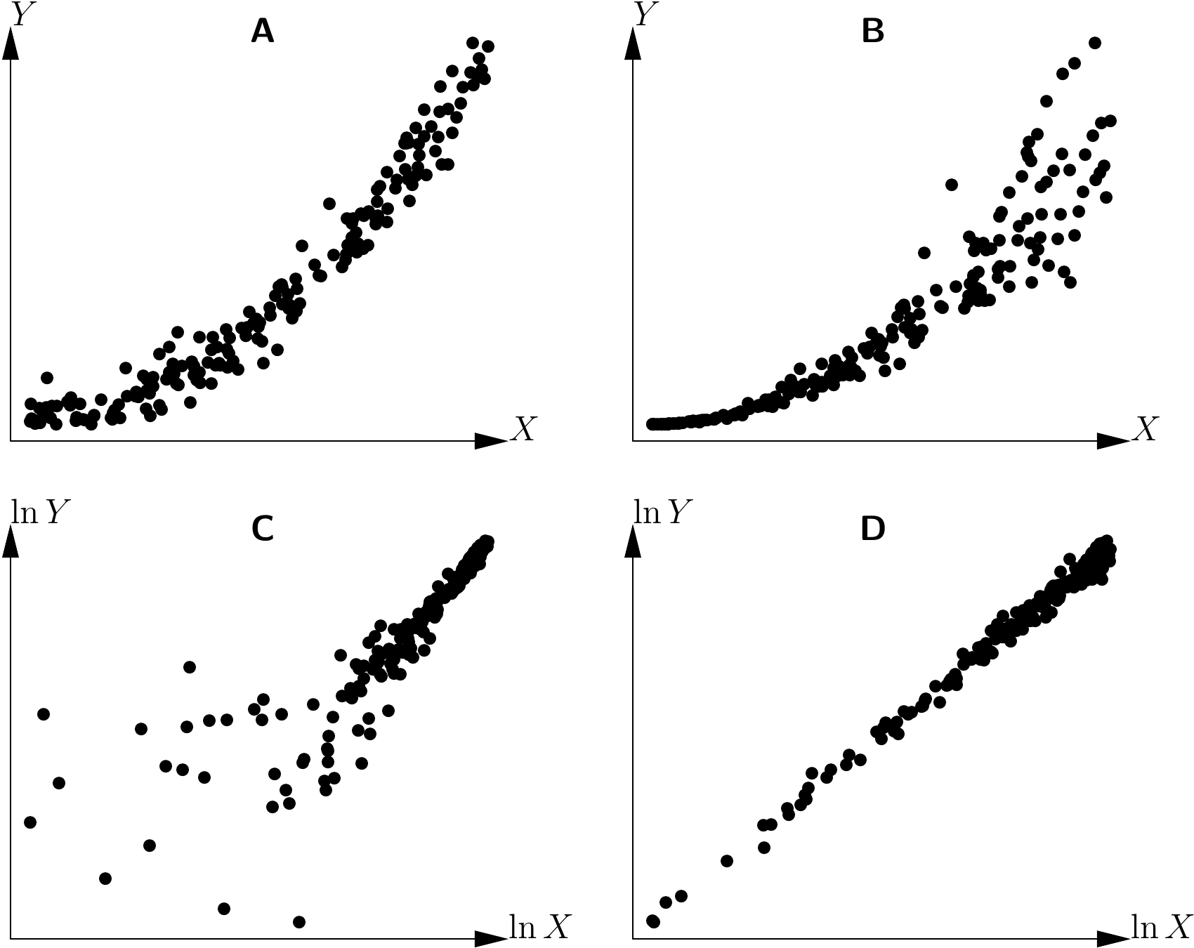
Figure 5.15: Power model with additive (A and C) or multiplicative (B and D) error. Plot (C) (respectively D) results from plot (A) (respectively B) by transformation of the variables \(X\rightarrow\ln X\) and \(Y\rightarrow\ln Y\).
Thus, when the model linking \(Y\) to \(X\) is linearized by a variables transformation, this affects both the form of the mean relation and that of the error term. This property may be used to stabilize residuals that vary with \(X\) rendering them constant, but this point will be addressed in the next chapter. For the moment, we are looking to explore the form of the error \(Y-\mbox{E}(Y)\) in relation to \(X\), without transforming the variables \(X\) and \(Y\).
As the form of the mean relation \(\mbox{E}(Y)=f(X)\) has already been determined graphically, a simple visual examination of the plot of \(Y\) against \(X\) will show whether the points are evenly distributed on each side of the curve \(f\) for all values of \(X\). Plots (a) and (b) in Figure 5.1, for example, illustrate the case of residuals of constant variance at all values of \(X\), whereas plots (c) and (d) in the same figure show the case of residuals that increase in variance with \(X\). More complex relations, like that illustrated in Figure 5.16, may also be imagined. In the particular case illustrated by Figure 5.16, the variance of the residuals fluctuates periodically with \(X\).
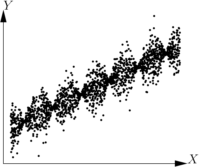
Figure 5.16: Scatter plot of points generated by the model \(Y=a+bX+\varepsilon\), where \(\varepsilon\) follows a normal distribution with a mean of zero and a standard deviation proportional to the cosine of \(X\).
However, there is little risk of encountering such situations in practice in the context of biomass or volume tables. In almost all cases we need to choose between two situations: the variance of the residuals is constant or increases with \(X\). In the first case, nothing further needs to be done. In the second case, there is no need to investigate the exact form of the relation between \(X\) and the variance of the residuals, but simply from the outset adopt a power model to link the variance of the residuals \(\varepsilon\) to \(X\): \[ \mbox{Var}(\varepsilon)=\alpha X^{\beta} \] The values of the coefficients \(\alpha\) and \(\beta\) can be estimated at the same time as those of the model’s other coefficients during the model fitting phase, which will be considered in the next chapter.
5.3 Exploring doesn’t mean selecting
By way of a conclusion, it should be underlined that this graphical exploration does not aim to select a single type of model, but rather to sort between models that are able to describe the dataset and those that are not. Far from seeking to select THE model assumed to be the best at describing the data, efforts should be made to select three or four candidate models likely to be able to describe the data. The final choice between these three or four models selected during the graphical exploration phase can then be made after the data fitting phase that is described in the next chapter.